Behind-the-scenes look at “André Kertész: Postcards from Paris”

IMG_7161 Planning and mounting an exhibition is always difficult. This one was made even more difficult because most of the work was done during the pandemic when the museum staff at the Art Institute of Chicago was working remotely or spending limited time at the museum.


We asked Elizabeth Siegel, the curator of the show if she would share the background story of the exhibit and some of the special challenges they faced.  Her answers are below. 1. An exhibit of this size normally takes how long? An exhibition like this usually takes several years. Each layer of complexity-research, travel, many to international lenders, planning for a tour, or publishing a catalogue-adds time to the project. But that doesn’t mean we are working on a single project for the entire time. I typically juggle different projects at different stages of completion. Things definitely heat up in the final stretch! 2. Was this exhibit planned before the pandemic started? Oh, yes. (See the answer to question #1 about how long a show like this takes!) The travel and bulk of the research was completed before the world shut down, but then we had the added complexity of doing much of the collaborative work remotely. 3. Did the funding come from one or multiple sources i.e. individual donors, foundations, grants, etc,

We had funding from several sources. We are always grateful to our funders, who help turn our ambitions into reality, and we always thank them wherever we can. You can see the list of individuals and foundations who helped support the exhibition and book in the acknowledgments pages of the catalogue, the exhibition credits on the title wall of the show, and on our website.


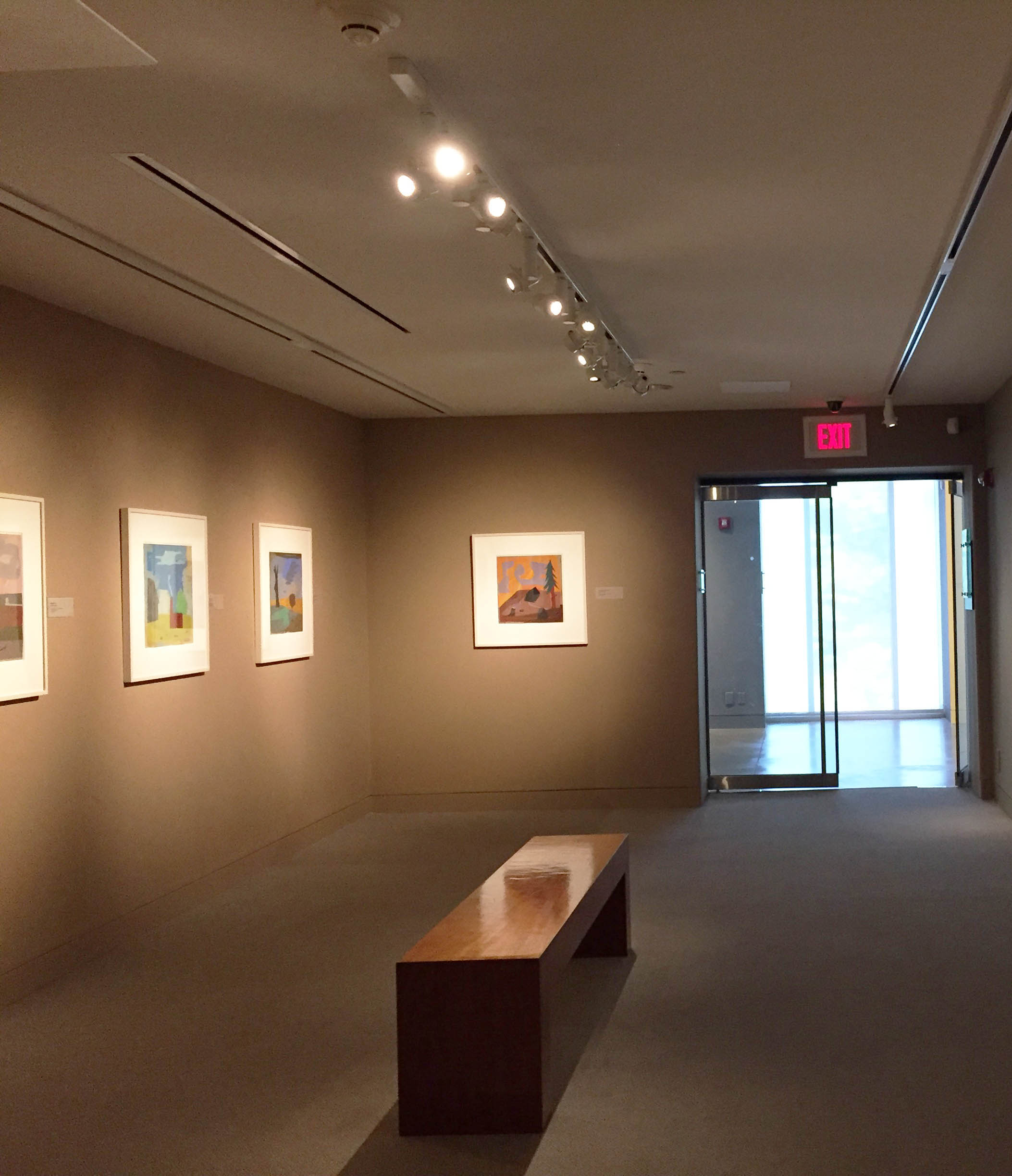
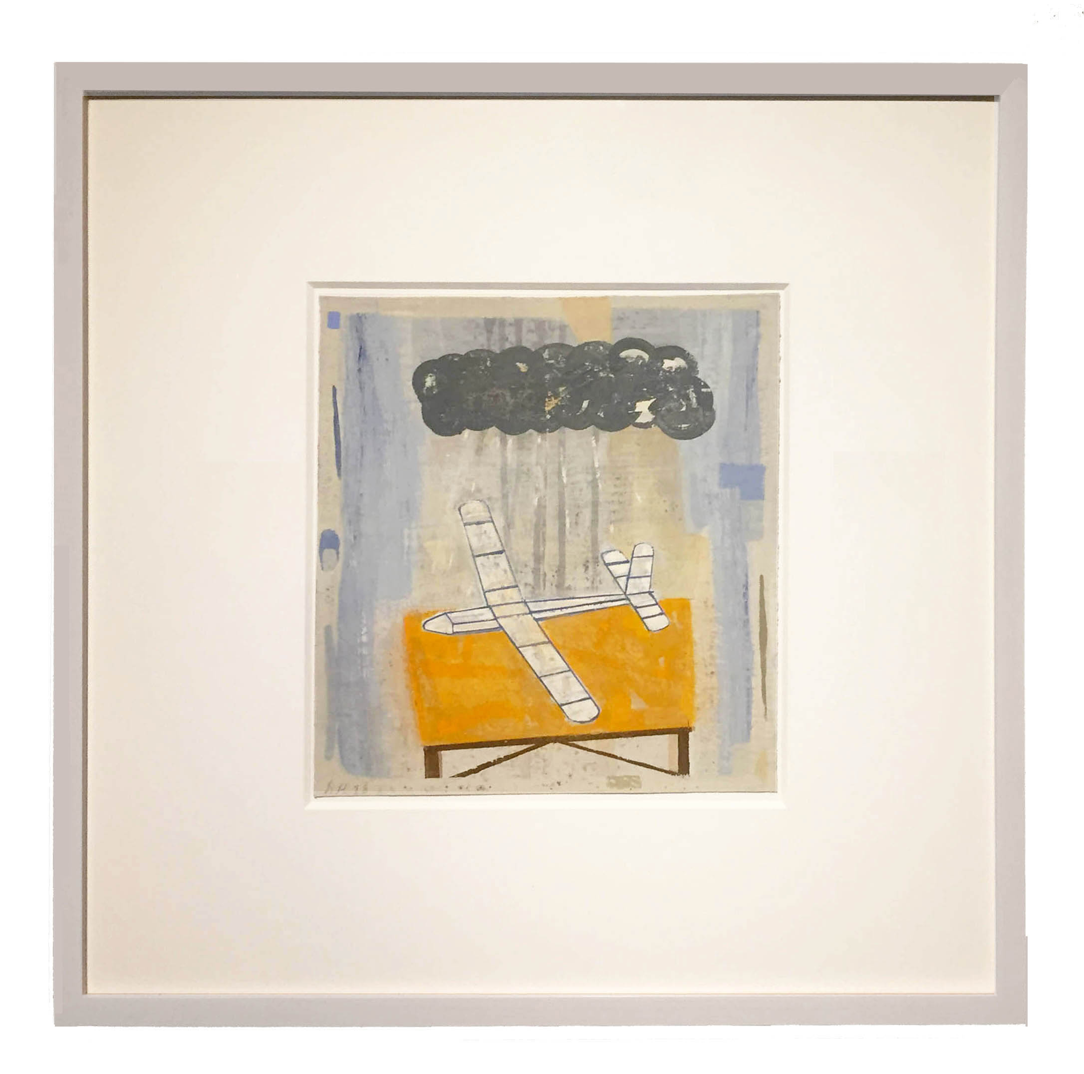
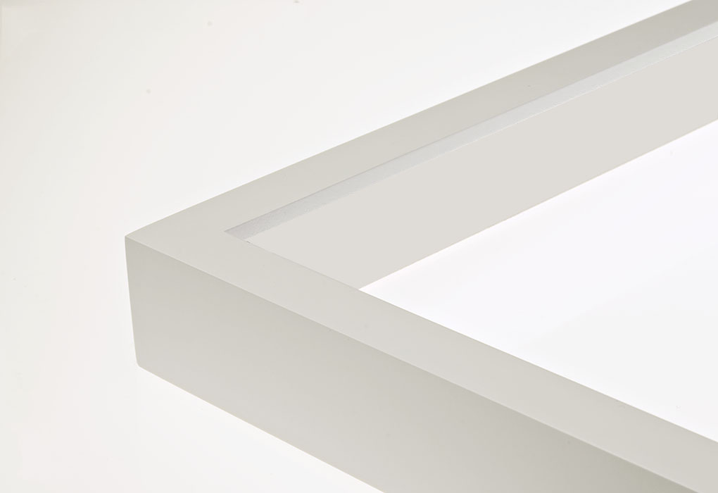
4. I know you used photos from the AIC collection and you were loaned additional photos from collectors, galleries, and museums in the United States, Canada, and Germany.  Can you explain the process the AIC goes through to assemble the photos that will ultimately be in the exhibit? Well, one thing that was definitely reinforced for me during the pandemic was the need to see photographs in person! One of my main arguments in this exhibition is that photographs are objects, not just images, and so I needed to go see each one to assess the quality of the print. (Fortunately, Kertész was a very good and consistent printer, so there weren’t many surprises.) And I was also trying to show a range of works he produced during this period (known and unknown), as well as make sure that really key photographs-such as Satiric Dancer, Chez Mondrian, and Fork-could be included in the show. The process is a bit of detective work, combing through old auction catalogues, relying on the terrific memories of dealers and colleagues, visiting museums, locating collectors. 5. Each lender was sent a complete frame package (frame, strainer, matboard, acrylic and backing board). They then framed their photos and shipped them back to the AIC. This, obviously, takes extra work and more time.  What is the reason you didn’t have them send you the photo unframed and had the framing done at the museum? As I mentioned, I wanted to make sure visitors understood these photographs as complete objects, not just images. That meant, to me, including all the blank space of the carte postale, which I believe Kertész included as a kind of built-in frame for the image. The way that the objects are framed is a crucial part of this argument: each photograph is floated in an 8-ply mat, which emphasizes the material qualities of the whole print. We also wanted a uniformity of appearance among the many lenders’ works, and so we devised a framing profile that just looks fantastic. (Thank you, Metropolitan Picture Framing!). Once we figured out how we wanted everything to look, we had to consider logistics of shipping (as well as the object’s return) and the safety of the art. Working with our registrar, preparator, and conservator, we decided it was best to ship the frames to each lender in advance and have the whole package sent back to us. ketertz frame 6. Working with multiple staffs and departments is always challenging. Doing this during a pandemic with reduced museum hours and many of the staff working remotely takes a Herculean effort. Can you discuss some of the issues that each had to address i.e.  curatorial,  marketing and communication , exhibition design,  installation, funding, public programming , interactive education, preparators, etc. It was quite an experience! To begin with, it helps to have a really top-notch team, and every single person working on the exhibition demonstrated creativity, resourcefulness, and personal pride in the project. One example I can speak to is the exhibition design process. 
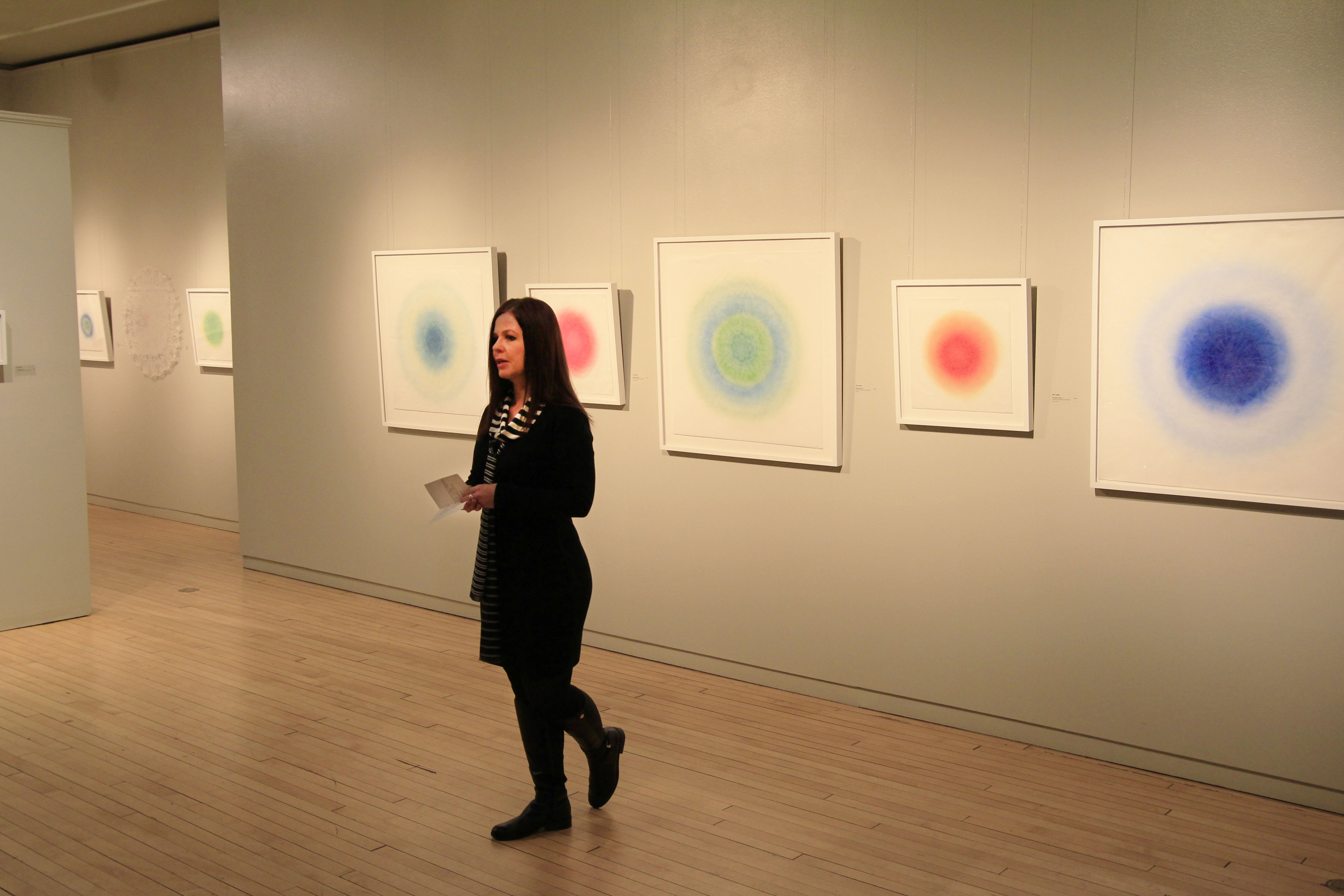
Our designer, Samantha Grassi, worked with me over Zoom to iterate several designs (she is a whiz with changing things in the software on the fly). What we ended up with was a design that really speaks to the blank and negative spaces of the paper and the individuality of the photographic object, all in a beautiful setting for viewing. We had one bang-up, four-hour design session in which we laid out every single object in the exhibition. After that, there were small tweaks but we basically got it. If only I could be that productive in other areas of my life!
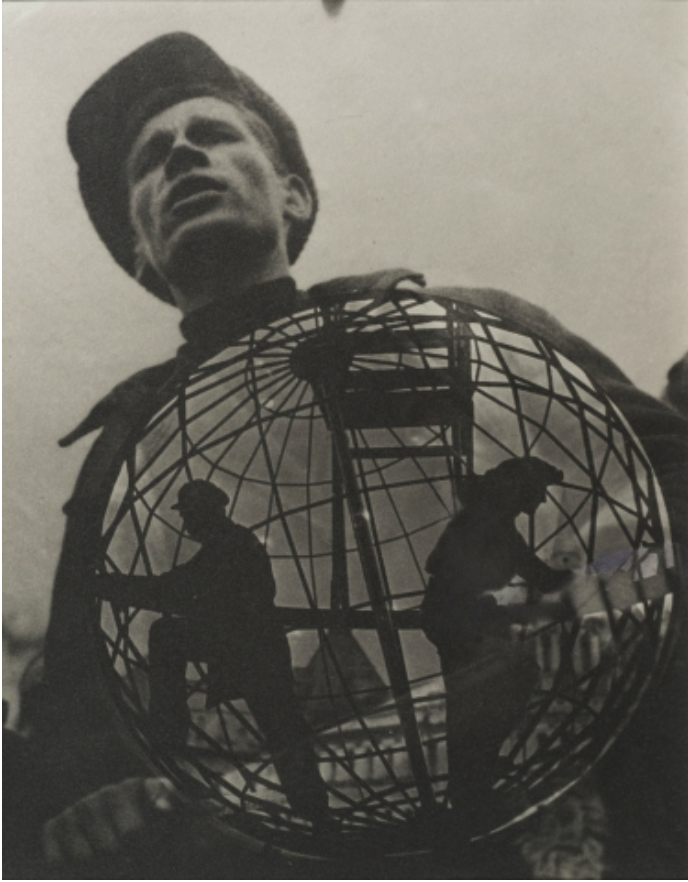
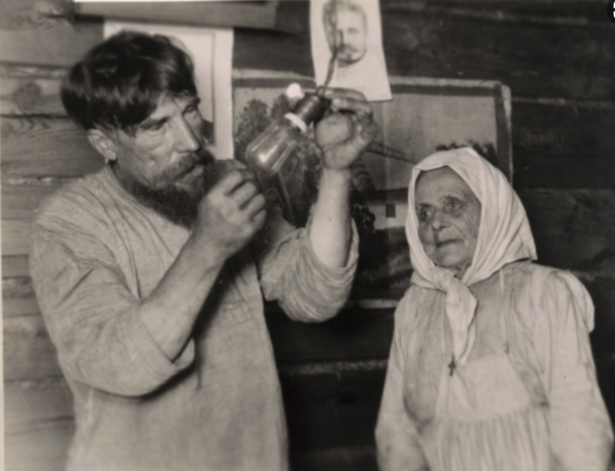
 IMG_7141

André Kertész

Photographer André Kertész (American, born Hungary, 1894-1985) arrived in Paris in the fall of 1925 with little more than a camera and some savings.

By the end of 1928, he was contributing regularly to magazines and exhibiting his work internationally alongside well-known artists like Man Ray and Berenice Abbott. The three years between his arrival in Paris and his emergence as a major figure in modern art photography marked a period of dedicated experimentation and exploration for Kertész. During this time he carved out a photographic practice that allowed him to move between the realms of amateur and professional, photojournalist and avant-garde artist, diarist and documentarian.

For those three years only, Kertész produced most of his prints on carte postale, or postcard, paper. Although his choice may have initially been born of economy and convenience, he turned this popular format toward artistic ends, rigorously composing new images in the darkroom and making a new kind of photographic object. The small scale of the cards also allowed them to circulate in a way befitting an immigrant artist-shared with a widening circle of international friends at the café table or sent in an envelope to faraway family.

IM048965-int_presssm

André Kertész. Satiric Dancer, 1927. Family Holdings of Nicholas and Susan Pritzker. © Estate of André Kertész 2021

IM048962-int_press

André Kertész. Mondrian’s Pipe and Glasses, 1926. Family Holdings of Nicholas and Susan Pritzker. © Estate of André Kertész 2021.

257175_Kertesz_Hilda_Daus_press-1

André Kertész. Hilda Daus, 1927. Private collection, courtesy Corkin Gallery, Toronto. © Estate of André Kertész 2021.

André Kertész: Postcards from Paris

Oct 2, 2021 – Jan 17, 2022

Art Institute of Chicago

Chicago, IL


ALEJANDRO CARTAGENA: PHOTO STRUCTURE / FOTO ESTRUCTURA at Eastman Museum

For this latest body of work, Cartagena spent time sifting through landfills on the outskirts of Mexico City to collect thousands of discarded photographs—portraits, snapshots, and tourist views. Cartagena excises figures, faces, or other details from the found photographs and reconfigures the original compositions by either moving the cut fragments or removing them entirely. The altered photographs remain strangely whole and strikingly familiar, compelling the viewer to consider what gives a photograph meaning. His arrangements reveal that seemingly crucial aspects of an image are both central and incidental to our ability to understand the works.

Cartagena is producing works of art specifically for this exhibition, giving visitors to the Eastman Museum the first opportunity to see the newest photographs in his most recent body of work.


StudioSession-849.jpg
Alejandro Cartagena (Mexican, b. Dominican Republic, b. 1977). Detail from Narciso / Narcissus, 2019. Altered gelatin silver print. Courtesy of the artist. © Alejandro Cartagena
StudioSession-849
Alejandro Cartagena (Mexican, b. Dominican Republic, b. 1977). Detail from Narciso / Narcissus, 2019. Altered gelatin silver print. Courtesy of the artist. © Alejandro Cartagena
StudioSession-904.jpg
Alejandro Cartagena (Mexican, b. Dominican Republic, b. 1977). Detail from Rostros / Faces, 2019. Altered gelatin silver print. Courtesy of the artist. © Alejandro Cartagena

StudioSession-904
Alejandro Cartagena (Mexican, b. Dominican Republic, b. 1977). Detail from Rostros / Faces, 2019. Altered gelatin silver print. Courtesy of the artist. © Alejandro Cartagena

StudioSession-901.jpg
Alejandro Cartagena (Mexican, b. Dominican Republic, b. 1977). Detail from Vacaciones familiares (después Roma) / Family Vacation (after Roma), 2019. Altered gelatin silver print. Courtesy of the artist. © Alejandro Cartagena

StudioSession-901
Alejandro Cartagena (Mexican, b. Dominican Republic, b. 1977). Detail from Vacaciones familiares (después Roma) / Family Vacation (after Roma), 2019. Altered gelatin silver print. Courtesy of the artist. © Alejandro Cartagena

About the artist

Cartagena lives and works in Monterrey, in northeastern Mexico. His projects employ landscape and portraiture as a means to examine social, urban, and environmental issues. His work has been exhibited internationally and is part of public and private collections, including the San Francisco Museum of Modern Art, the Museum of Contemporary Photography in Chicago, the JPMorgan Chase Art Collection, the Museum of Fine Arts in Houston, the Harry Ransom Center at the University of Texas, and the George Eastman Museum.

Cartagena is also a self-publisher and co-editor of photobooks and has been published internationally in magazines and newspapers such as the New York Times, Le Monde, and the New Yorker. He is the recipient of several awards, including the international Photolucida Critical Mass Book Award, the Lente Latino award in Chile, and the Premio IILA-FotoGrafia Award in Rome.

ALEJANDRO CARTAGENA: PHOTO STRUCTURE / FOTO ESTRUCTURA
January 31, 2020 - June 28, 2020
George Eastman Museum, Rochester, NY
ALEJANDRO CARTAGENA: PHOTO STRUCTURE / FOTO ESTRUCTURA
January 31, 2020 – June 28, 2020
George Eastman Museum, Rochester, NY
ALEJANDRO CARTAGENA: PHOTO STRUCTURE / FOTO ESTRUCTURA
January 31, 2020 – June 28, 2020
George Eastman Museum, Rochester, NY

Framing Specifications


eastman frame
Capture0002-712_114MP01_spacer700

METRO GALLERY FRAME

Profile: 114
Type: Thin Gallery Frame
Wood & Finish: unfinished ash frame
Purchasing Option: joined wood frame
Custom Wood Strainer: 1/2″ wood frame strainer


Terri M Wells Brinton AIR Museum Show

The 2019 Brinton Artists in Residence show features six diverse, nationally recognized artists who were invited for two-week residencies in 2018 to create art en plein air. The Brinton’s Artists in Residence program allows artists the unique opportunity to sketch, draw and paint on The Brinton grounds and also on other scenic locations throughout the area. Resident artists are featured in a group exhibition in the fall of the following year of their residency.

Terri M. Wells “Big Horn Movement III”                 11” x15", watercolor and ink
Terri M. Wells “Big Horn Movement III” 11” x15″, watercolor and ink
Terri M. Wells “Big Horn Movement V”                16” x 38” watercolor
Terri M. Wells “Big Horn Movement V” 16” x 38” watercolor
Terri M, Wells “Big Horn Movement IV”           11” x 15” watercolor and ink
Terri M, Wells “Big Horn Movement IV” 11” x 15” watercolor and ink

About the artist

Terri Wells With an eye for nuanced, vibrant color, and memorable compositions, Terri paints outdoors on-location throughout the U.S. Some paintings are preliminaries for abstract sculptures and studio work. Terri was Plein Air Austin’s president and chairman of the board 2005-2008. She has participated in many national shows including Maynard Dixon Country and America’s Parks Through the Beauty of Art. In 2018, she received a two-week residency from the Brinton Museum in Big Horn, WY. In 2019, Terri was invited to be one of 31 centennial artists for the Art of Texas State Parks Project. Her work sells in national shows, direct, and the Thunderbird Foundation, Mt. Carmel, UT.

TMWells_BrintonAIROpening_5A
Brinton Artists in Residence Exhibition
September 7, 2019 – October 20, 2019
The Brinton Museum Big Horn, Wyoming

Framing Specifications

Terri M. Wells “Big Horn Movement I”     
 11” x 22” watercolor and ink
Terri M. Wells “Big Horn Movement I”
11” x 22” watercolor and ink
Capture0018-431 101MP01_50 SPACER_STRAINER

METRO GALLERY FRAME

Profile: 101
Type: Standard Gallery Frame
Wood & Finish: maple frames with clear lacquer finish
Purchasing Option: joined wood frame with matching splines
Custom Wood Spacer: 1/2 wood frame spacer
Custom Wood Strainer: 3/4″ wood frame strainer


In Bloom: The Botanical Paintings of T. Merrill Prentice

The New Britain Museum of America is exhibiting an array of botanical paintings by Connecticut native T. (Thurlow) Merrill Prentice (1898–1985). This is the most extensive exhibition of these paintings at the NBMAA since their gift by the artist in 1977. Prentice’s vibrant watercolors showcase lively wildflowers and plants found throughout the American Northeast. These plants and flowers became a subject of fascination for the artist, and from the late 1960s to the early 1970s, Prentice produced hundreds of carefully observed paintings of rare and common species. His works were exhibited at venues such as the Hartford Art School and the New York Botanical Garden, and a portfolio of 114 botanical studies by Prentice was published in the book Weeds and Wildflowers of Eastern North America (1973). Capturing the beauty and resilience of flowers in a staggering variety, Prentice’s delicate watercolors serve as inspiration for the preservation and appreciation of our natural world.

T. Merrill Prentice (1898—1985), Day Lily, 1969, Watercolor, 24 x 18 1/8 in., New Britain Museum of American Art, Gift of the Artist

T. Merrill Prentice (1898—1985), Day Lily, 1969, Watercolor, 24 x 18 1/8 in., New Britain Museum of American Art, Gift of the Artist

About the artist

During his life, Prentice was a celebrated architect who ran firms in New York and Hartford from the 1920s to the 1960s, following studies at Yale, Columbia University, and the École des Beaux-Arts in Paris. While studying in France in the mid-1920s, Prentice became interested in watercolor, a medium that he enjoyed using but had little time to devote himself to until four decades later, following his retirement in 1965. After settling in Cornwall, Connecticut, in his later life, Prentice began to observe and paint wildflowers he found throughout his property and the wider region.

In Bloom: The Botanical Paintings of T. Merrill Prentice

March 25, 2019–September 8, 2019

The Helen T. and Philip B. Stanley Gallery

New Britain Museum of American Art, New Britain, CT

nbmaa exhibit 1

Canada Goldenrod , Watercolor 1977.77.95. Wood lily, watercolor 1977.77.53. Burdock, Watercolor 1977.77.70

Framing Specifications

Purple Loosestrife 1971, Watercolor 1977.77.88.
101MP14strainer

METRO GALLERY FRAME

Profile: 106
Type: Standard Gallery Frame
Wood & Finish: maple frame with charcoal finish
Purchasing Option: joined wood frame
Custom Wood Strainer: 3/4″ wood frame strainer
Custom Frame Acrylic:  acrylic cut to size
Custom Frame Mats/sized boards: 4 ply antique white sized board


Time Frames: Contemporary East Asian Photography at Baltimore Museum of Art

“Time Frames: Contemporary East Asian Photography” exhibition has more than 40 modern and contemporary photographs by artists mostly born in China, Japan, South Korea, or Vietnam who delve into various concepts of time. Their images could be focused on a time of day, a past legend or history, or an imagined future.

“Time Frames showcases recent important gifts to the BMA’s outstanding photography collection as well as rarely shown works by East Asian artists working in this medium,” said BMA Dorothy Wagner Wallis Director Christopher Bedford. “The extraordinary range of these works extends from hyperbolic and contemplative images to personal experiences and collective histories.”

The exhibition includes photographs, books, prints, and a hand scroll drawn primarily from the BMA’s collection. These works have never been shown in Baltimore or haven’t been displayed by the BMA for decades.

This image is owned by The Baltimore Museum of Art; permission to reproduce this work of art must be granted in writing. Third party copyright may also be involved.

Daido Moriyama. Tokyo. 2008, printed 2012. Collection of Brenda Edelson, Santa Fe © Daido Moriyama

This image is owned by The Baltimore Museum of Art; permission to reproduce this work of art must be granted in writing. Third party copyright may also be involved.

Noh Suntag. Red House No. 01‑13. 2007, printed 2011. From the series Ephemeral. The Baltimore Museum of Art: Gift of Brenda Edelson, Santa Fe, BMA 2018.93. © Noh Suntag

This image is owned by The Baltimore Museum of Art; permission to reproduce this work of art must be granted in writing. Third party copyright may also be involved.

Lê Van Khoa. Rescue. 1974. The Baltimore Museum of Art: Gift of the Artist, BMA 1978.16.3. © Lê Van Khoa

The Baltimore Museum of Art

The BMA’s internationally renowned collection of 95,000 objects encompasses more than 1,000 works by Henri Matisse anchored by the famed Cone Collection of modern art, as well as one of the nation’s finest holdings of prints, drawings, and photographs. The galleries showcase an exceptional collection of art from Africa; important works by established and emerging contemporary artists; outstanding European and American paintings, sculpture, and decorative arts; ancient Antioch mosaics; and exquisite textiles from around the world.

The 210,000-square-foot museum is distinguished by a grand historic building designed in the 1920s by renowned American architect John Russell Pope and two beautifully landscaped gardens featuring an array of 20th-century sculpture.

This image is owned by The Baltimore Museum of Art; permission to reproduce this work of art must be granted in writing. Third party copyright may also be involved.

Time Frames: Contemporary East Asian Photography

November 4, 2018, to March 24, 2019

Baltimore Museum of Art, Baltimore, MD

Framing Specifications

Painted  black gallery frame with spacer and strainer
Painted black gallery frame with spacer and strainer
Painted white gallery frame with spacer and strainer

METRO GALLERY FRAME

Profile: 101
Type: Standard Gallery Frame
Wood & Finish: maple frame with white or black painted finish
Purchasing Option: joined wood frame
Custom Wood Spacer: 1/2″ wood frame spacer
Strainer: 3/4″ wood strainer with crossbar


David Hornung “Intimate Visions” at Delaware Art Museum

I use my memory and imagination to invent pictures. The subjects I like to paint are ordinary—walls, ladders, rocks, trees, simple buildings, garden tools, ropes, bones, rickety tables. I strip subject matter of extraneous detail so that it appears emblematic rather than naturalistic. This also makes it possible to intermingle pictorial elements with abstract and semi abstract shapes. Such stylization allows fluid interrelationships between color, shape and symbol in a way that, I hope, communicates my wonderment at the mystery and uncertainty of existence.

David Hornung "Under Darkness" gouache on handmade paper
11 x 9 3/4", 2018
David Hornung “Under Darkness” gouache on handmade paper
11 x 9 3/4″, 2018
David Hornung "Red Cloud" gouache and casein on handmade paper, 9 x 12", 2018
David Hornung “Red Cloud” gouache and casein on handmade paper, 9 x 12″, 2018
David Hornung, "Night Garden" gouache on handmade paper
11 x 9 7/8", 2018
David Hornung, “Night Garden” gouache on handmade paper
11 x 9 7/8″, 2018

About the artist

David Hornung studied painting at the University of Delaware where he received a BA and at the University of Wisconsin-Madison where he earned an MA and MFA.

After college Mr Hornung took a teaching position in the art department at Indiana University-Bloomington. Since then, he has supported himself primarily as a professor of painting, drawing, and color at a number of art schools and universities in the United States. These include the Parsons School of Design, Pratt Institute, Skidmore College, Brooklyn College and The Rhode Island School of Design. He is currently teaching at Adelphi University in New York.

Throughout his career, Mr Hornung has pursued painting and has exhibited widely. He has also made fabric constructions, collages and has recently begun to experiment with a way to combine collage and cyanotype.

While a student at the University of Delaware, Mr Hornung was deeply affected by a color course based on the teaching of Josef Albers at Yale. Color became a major consideration in his work and, at Skidmore College in 1982, he developed his first color curriculum for undergraduate art majors. When he came to The Rhode Island School of Design in the mid eighties, he continued teaching color to undergraduates in a variety of disciplines. There, he designed color curricula for painters, illustrators, textile designers and graphic designers working at times in each of those departments.

By the mid nineties, Hornung’s color course was offered every semester at RISD and, encouraged by a friend and colleague at the Art Institute of Chicago; he began to write a book based upon his color pedagogy. He was inspired by Edward Tufte’s 1990 publication, Envisioning Information and particularly admired the straightforward design of Tufte’s book and the way he placed his illustrations close to the text. Hornung decided to learn the software needed to design his book himself. After a 10-year gestation period, Color: A Workshop for Artists and Designers was published in 2005 by Laurence King Ltd, London. Since then the book has been translated into five languages and a second edition appeared in 2012.


install- De. Art Museum

David Hornung “Intimate Visions” 8/25/18 – 1/26/19 Delaware Art Museum

“Intimate Visions”
Paintings on Paper featuring David Hornung, Constance Moore Simon, and Zaneta Zubkova

August 25, 2018 – January 26, 2019

Delaware Art Museum, Wilmington, DE

Glider-David-Hornung-2018-framed-image-3

Framing Specifications

Capture0002-712_114MP05_700

METRO GALLERY FRAME

Profile: 114
Type: Thin Gallery Frame
Wood & Finish: maple frame with pickled white finish
Purchasing Option: joined wood frame with matching splines
Custom Frame Acrylic: uv acrylic cut to size
Custom Frame Backing Board: acid free foamboard cut to size


Brian Dailey WORDS at American University Museum

KAG-01

Brian Dailey’s towering, multi – screen video installation WORDS — the creative summation of an odyssey that took him to nearly ninety countries over the course of six years — is the artist’s investigation into the impact of globalization on the interrelation between language, culture, and environment. While offering a contemporary turn on primordial stories such as the Tower of Babel, the kaleidoscopic, cacophonous, and mesmerizing structure is rooted in the present and seeks to elucidate through this inventive vehicle how languages, and the words upon which they are built, shape our global realities. A powerful visual expression of the challenges faced in communicating across linguistic boundaries and national borders in today’s world , WORDS also reveals the captivating dynamism of humanity in the expressive, physical presence of the range of personalities who come to life on the flickering screens.

Against the backdrop of an international geopolitical landscape undergoing tumultuous and historic changes, Dailey created a list of thirteen words that spoke to larger philosophical concerns facing humanity and found international resonance: Peace, war, love, environment, freedom, religion, democracy, government, happiness, socialism, capitalism, future, and United States. He visited public and private venues on all seven continents, set up his camera and green – screen backdrop in various locales, and invited passersby to be interviewed. A local facilitator presented each of the thirteen words in the participants’ native language and invited them to express — in a single word —the first impression each of the nouns evoked.

Brian Dailey "WAR", 2018 Inkjet on Photo Museum Etching paper 18 x 22 in

Brian Dailey “WAR”, 2018 Inkjet on Photo Museum Etching paper 18 x 22 in

Most frequent responses from around the world: Peace, Death, Destruction

Brian Dailey "DEMOCRACY" 2018 Inkjet on Photo Museum Etching paper 18 x 22 in

Brian Dailey “DEMOCRACY” 2018 Inkjet on Photo Museum Etching paper 18 x 22 in

Most frequent responses from around the world: Freedom, Politics, Liberty

GOVERNMENT

Brian Dailey “GOVERNMENT” 2018 Inkjet on Photo Museum Etching paper 18 x 22 in
Most frequent responses from around the world: Corruption, Power, Good

Brian Dailey "FREEDOM" 2018 Inkjet on Photo Museum Etching paper 18 x 22 in

Brian Dailey “FREEDOM” 2018 Inkjet on Photo

Most frequent responses from around the world: Peace, Happiness, Life

KAG-02

Words about WORDS
Represented in these prints is every word uttered by the nearly 2,000 participants who responded to the thirteen prompts propelling this project. Giving voice to each and every individual who engaged in the WORDS endeavor, the various responses were calibrated and scaled to reflect the frequency in which they were articulated. The textual array manifest in this print series silently mirrors the poetic elements emanating from the towering installation while visually mapping the same territory.

About the artist

Perhaps no word better characterizes Brian Dailey (b. 1951) than polytropos, the first adjective Homer applies to Odysseus in the Odyssey. Translated from the Greek as “well traveled,” “much wandering,” and, in a more metaphorical sense, as “the man of many twists and turns,” polytropos suitably describes Dailey’s life journey and its many peregrinations. As a student at Otis Art Institute (MFA, 1975) and in his ensuing art career in Los Angeles, Dailey participated in the pioneering creative experimentation defining the prolific artistic milieu in California in this era. His early career launched him on a path that—before bringing him full circle back to his roots as an artist—took him through a twenty-year interlude working on arms control and international security. These unusual experiences, which he approached with the same curiosity that has driven his art, provide a fertile source of inspiration in his idiosyncratic creative practice. As the artist states:

There is art in politics and politics in art. Throughout my life two passions stimulated my curiosity: art and international politics. The tension between two interests generated my intense inquiry into these seemingly diametrically opposed professional fields. In the context of my career, the wanderings through a labyrinth of artistic and intellectual encounters provided a lifetime of eclectic experiences, which, in turn, supplied a bounty of material for my art.

Based in the Washington DC metropolitan area, Dailey is an artist whose work in a range of media, including photography, film, installations, and painting, draws on his multifaceted life experiences. His conceptual and performance based art expands the parameters of the mediums in which he works, defying easy categorization. Engaging with the social, political, and cultural issues of our times, his work is informed by his unusual background and unconventional evolution as an artist.

See more information about the artist and this project: http://www.briandaileyart.com/words/

Brian Dailey WORDS

January 27 – March 11, 2018

American University Museum

Washington, D.C.

Framing Specifications

Painted maple frame with dolphin finish, matching spacer, and strainer

METRO GALLERY FRAME

Profile: 101 Type: Floating Gallery Frame
Wood & Finish: maple frame with painted dolphin finish
Purchasing Option: joined wood frame
custom wood spacer: 1/2″ matching wood frame spacer
Custom wood strainer: 3/4″ wood frame strainer
Custom frame acrylic: 1/8″ regular acrylic cut to size
Custom frame backing board: 1/8″ acid free foamboard cut to size


Amy Sands at Rourke Art Museum

“I am interested in the interaction of color, space and memory – both from a perspective of the artist’s process as well as from the viewer’s active interaction with a finished piece.  My art originates in my interest of the day-to-day experiences influenced by color, pattern and space, and how this is recorded in memory. Lace and craft doilies of family heritage serve as a vantage point for my work.  These compositions become transformed into a deeper temporal and psychological space through the complex layering of the intricate patterns and how they interact with light and shadow.
I choose monotypes mixed with traditional painting methods because of the intimate interactions that arise as they build and change – many times out of my control – forcing me to act and react. In my process, thought is overcome by an impulsive, subconscious interaction. What develops is from the psyche, leading often to layered and oppositional fields of color. Collectively, these layers are refined into the essential ingredients of a moment in space and time.”

​—AMY SANDS, 2018

Amy Sands RevolutionXXXVI monoprint, serigraphy and laser cut on layered kozo 1/1 2017

Amy Sands “RevolutionXXXVI” monoprint, serigraphy and laser cut on layered kozo 1/1 2017

Amy Sands Revolution "Hope" XXXI monoprint, serigraphy and laser cut on layered kozo 1/1 2017

Amy Sands “Revolution:Hope” monoprint, serigraphy on layered kozo 1/1 2017

Amy Sands "Revolution XXX1X" Monoprint, Serigraphy. laser cut on layered kozo 1/1 2018

Amy Sands “Revolution XXXIX” monoprint, serigraphy. laser cut on layered kozo 1/1 2018

About the artist

Amy Sands has exhibited her work in solo and group shows both nationally and internationally, including: Prints Tokyo 2012, Tokyo Metropolitan Art Museum; 8th International Printmaking Biennial of Douro, Portugal, 2016; the 2003 Madrid International Print Fair, Madrid, Spain (Estampa) and the 2016 Delta National Small Prints exhibition at the Bradbury Museum in Jonesboro, Arkansas. She has received a first place award for her work at the 57th Midwestern Invitational at the Rourke Art Museum in 2016, and a juror’s award at the 2013 MAPC Juried Members Exhibition at the McDonough Museum of Art, Youngstown, OH.  Sands’ work belongs in the permanent collections of the New York Public Library, Montefiore Hospital, Pratt Institute, Manhattan Graphics Center, Metropolitan State University, Buena Vista University, Central Lakes College as well as many private parties. Sands is currently Assistant Professor at Metropolitan State University and is represented by Muriel Guépin Gallery in New York City.

Amy Sands Exhibition at Rourke Art Museum 1/19/18- 2/18/18

Amy Sands: Portal

January 19, 2018 – February 18, 2018

The Rourke Art Museum

Moorhead, MN

FRAMING SPECIFICATIONS

Capture0008-545 106MP15 _700

METRO GALLERY FRAME

Profile: 106
Type: Standard Gallery Frame
Wood & Finish: maple frame with white opaque finish
Purchasing Option: joined wood frame
Strainer: 1/2″ wood strainer


Graphic Discontent: German Expressionism on Paper at Cleveland Museum of Art

Graphic Discontent: German Expressionism on Paper has more than 50 prints and drawings in the exhibition dating from 1905 to around 1922. They present their responses to urban life, the nude, landscape, and war. Together they show how the Expressionists’ new graphic language disrupted and distorted traditional artistic themes to describe both a modern utopia and a hell on earth.

Tanzerinnen (Dancers), 1917. Emil Nolde (German, 1876–1956). Woodcut; 23.8 x 31.2 cm. Delia E. Holden Fund, 1960.158. © Nolde Stiftung Seebüll, Germany

Tanzerinnen (Dancers), 1917. Emil Nolde (German, 1876–1956). Woodcut; 23.8 x 31.2 cm. Delia E. Holden Fund, 1960.158. © Nolde Stiftung Seebüll, Germany

Genesis II, 1914. Franz Marc (German, 1880–1916). Color woodcut; 24 x 20.2 cm. Gift of the Print Club of Cleveland, 1959.228

Genesis II, 1914. Franz Marc (German, 1880–1916). Color woodcut; 24 x 20.2 cm. Gift of the Print Club of Cleveland, 1959.228

Portrait of a Man, 1919. Erich Heckel (German, 1883–1970). Color woodcut; 46 x 32.6 cm. John L. Severance Fund, 1991.109. © 2017 Artists Rights Society (ARS), New York / VG Bild-Kunst, Bonn

Portrait of a Man, 1919. Erich Heckel (German, 1883–1970). Color woodcut; 46 x 32.6 cm. John L. Severance Fund, 1991.109. © 2017 Artists Rights Society (ARS), New York / VG Bild-Kunst, Bonn

Marsh Landscape, c. 1930–35. Emil Nolde (German, 1876–1956). Watercolor; 34 x 45.5 cm. Bequest of Dr. Paul J. Vignos Jr., 2011.125. © Nolde Stiftung Seebüll, Germany

Marsh Landscape, c. 1930–35. Emil Nolde (German, 1876–1956). Watercolor; 34 x 45.5 cm. Bequest of Dr. Paul J. Vignos Jr., 2011.125. © Nolde Stiftung Seebüll, Germany

ABOUT THE EXHIBITION

The beginning of the 20th century brought a surge of challenges to the prevailing styles and procedures for art making in Europe. Many young artists in central Europe rejected traditional training in state-sponsored art academies and formed groups with other artists who shared their desire to depart radically from what they saw as art’s emphasis on outward appearances. The groups Die Brücke (The Bridge), founded by Ernst Ludwig Kirchner, Karl Schmidt-Rottluff, and Erich Heckel in Dresden in 1905, and Der Blaue Reiter (The Blue Rider), founded by Wassily Kandinsky and Franz Marc in Münich in 1911, experimented together with form and technique, leading to groundbreaking publications and exhibitions. These and other artists working in Vienna and Berlin—collectively called the Expressionists—employed a condensed, abstracted visual language to access highly charged emotions or spiritual states.

Prints and drawings were essential to the Expressionists’ quest for art that was direct, frank, and immediate. Drawn from the Cleveland Museum of Art’s collection, Graphic Discontent: German Expressionism on Paper plots the purpose and impact of the graphic arts within the wider German Expressionist movement. Woodcuts—the most emblematic technique of the movement—were suited to the simplification and distortion of forms. New etching and lithographic techniques invited improvisation and promoted accidents in printing, while drawings revealed an artist’s impulse and urgency through direct marks on paper. These graphic media suited the Expressionists’ emphasis on the mystery and spontaneity of emotions.

Graphic Discontent: German Expressionism on Paper
January 14, 2108 – May 13, 2018
James and Hanna Bartlett Prints and Drawings Gallery
Cleveland Museum Of Art Cleveland, Ohio

FRAMING SPECIFICATIONS AND ADVICE

Profile: 114 Wood: Maple Finish: black

METRO GALLERY FRAME

Thin Profile: 114
Type: Thin Gallery Frame
Wood & Finish: maple frame with black opaque finish
Purchasing Option: joined painted frame
Custom Wood Strainer: 1/2″ wood strainer
Framing Advice: fitting gallery frames


Revoliutsiia! Demonstratsiia! Soviet Art Put to the Test at Art Institute of Chicago

The Art Institute of Chicago commemorates the centenary of the Russian Revolution with Revoliutsiia! Demonstratsiia! Soviet Art Put to the Test, an exploration of early Soviet art and its audiences.  It is the largest such exhibition in the United States in more than 25 years.

stenberg

Vladimir Stenberg and Georgii Stenberg. “The Mirror of Soviet Society,” cover for Red Field, no. 19 (May 1928). Ne boltai! Collection. Art © Estate of Vladimir and Georgii Stenberg/RAO, Moscow/VAGA, New York.

el elitzky

El Lissitzky. Photomontage for the International Hygiene Exhibition, Dresden, 1930. Alex Lachmann collection.

el ellitzky

El Lissitzky. Beat the Whites with the Red Wedge, 1920. Ne boltai! Collection.

shakhait

Arkadii Shaikhet. Lenin’s Light Bulb, 1925. The Art Institute of Chicago, restricted gift of Joyce Chelberg. © Arkadii Shaikhet Estate, courtesy of Nailya Alexander Gallery, New York.

ABOUT THE EXHIBITION

The exhibition, running October 29 through January 15, 2018, presents approximately 550 works in fine and applied arts in ways that evoke their original spaces of display. The installation features ten such spaces: battleground, school, press, theater, home, storefront, factory, festival, cinema, and exhibition. In each space original works of art hang alongside reconstructions of Soviet objects, furniture, or standalone rooms, including a Workers’ Club by Aleksandr Rodchenko and a Demonstration Room by El Lissitzky. Demonstration is the point of the exhibition: to show the many ways in which Soviet art and thought helped create an atmosphere of open-ended discussion about the future.

The 1917 Revolution is not treated here as a foregone conclusion but as a spur to conversation and debate. Exhibition curator Matthew Witkovsky, Richard and Ellen Sandor Chair of Photography, emphasizes, “I have tried to avoid treating the events of 1917 as a closed subject, or to imply that what came after was fated. I am most interested by a pressing Soviet concern that I expect will always be timely: determining art’s forms and functions in a society of our own making.”

Revoliutsiia! Demonstratsiia! makes clear that to build a revolutionary society required rethinking life top to bottom. From paintings to dinner plates, every class of object needed restructuring; activities as disparate as brushing one’s teeth or building giant public works were freighted with symbolic as well as practical significance. The cultural output was accordingly diverse, resourceful, and at the same time frenetic in its pace. Russia after 1917 became a showcase of models: models for monuments, models for mass distribution, models for behavior.  This model exhibition allows visitors to better understand the circumstances of the 1917 revolution — and to consider what ideals are embedded in the things of everyday life today.

Revoliutsiia! Demonstratsiia! Soviet Art Put to the Test

October 29, 2017 –  January 15, 2018
Art Institute of Chicago, Chicago, IL

FRAMING SPECIFICATIONS AND ADVICE

114MP13

METRO GALLERY FRAME

Thin Profile: 114
Type: Thin Gallery Frame
Wood & Finish: maple frame with black opaque finish
Purchasing Option: joined wood frame with matching splines
Custom Frame Strainer: 1/2″ wood frame strainer
Custom Frame Backing: 1/8″ archival coroplast cut to size
Framing Advice: fitting gallery frames